Taking a Pura Vida approach when selecting my favorite Pura diffuser scent.
When it comes to home fragrance, the Pura Diffuser Plug-In system is hands down my favorite (here’s why)! Especially during seasons when our schedules are hectic. I love that I can pick scents that make my home smell like my favorite candles, even when I am not home long enough to light and enjoy said candles!
From different scent types to brands, Pura has a wide variety of fragrances to pick from. When it comes to picking a favorite, I can never pick just one (and I usually don’t)! However, the ONE scent that I always have on hand year round is Capri Blue Volcano.
Capri Blue Volcano, my favorite scent for my Pura Diffuser.
Volcano by Capri Blue is just a fresh and classic scent. With fresh citrus and sugary notes, it is a crisp, clean and fresh scent. While I may occasionally switch out for a seasonal scent (Thanksgiving and Christmas), I always go back to Volcano in my diffusers! And I am constantly getting compliments on how amazing my house smells, and how I get my home to smell amazing without burning candles!
Want to check out Pura’s Fragrance bestsellers? Click here to check them out! If you are someone who loves fresh and floral scents, my other favorites are Capri Blue Aloha Orchid, Bridgewater Sweet Grace, and Nest Rose Noir & Oud!
Purchase two or more items and get FREE SHIPPING! How awesome is that! If there is any indication to my scent collection, I love taking advantage of the free shipping!
**This post contains affiliate links and I will be compensated if you make a purchase after clicking on my links
When it comes to home decor, I love to deconstruct trends and figure out how to make them myself. It’s something my mom taught me how to do growing up.
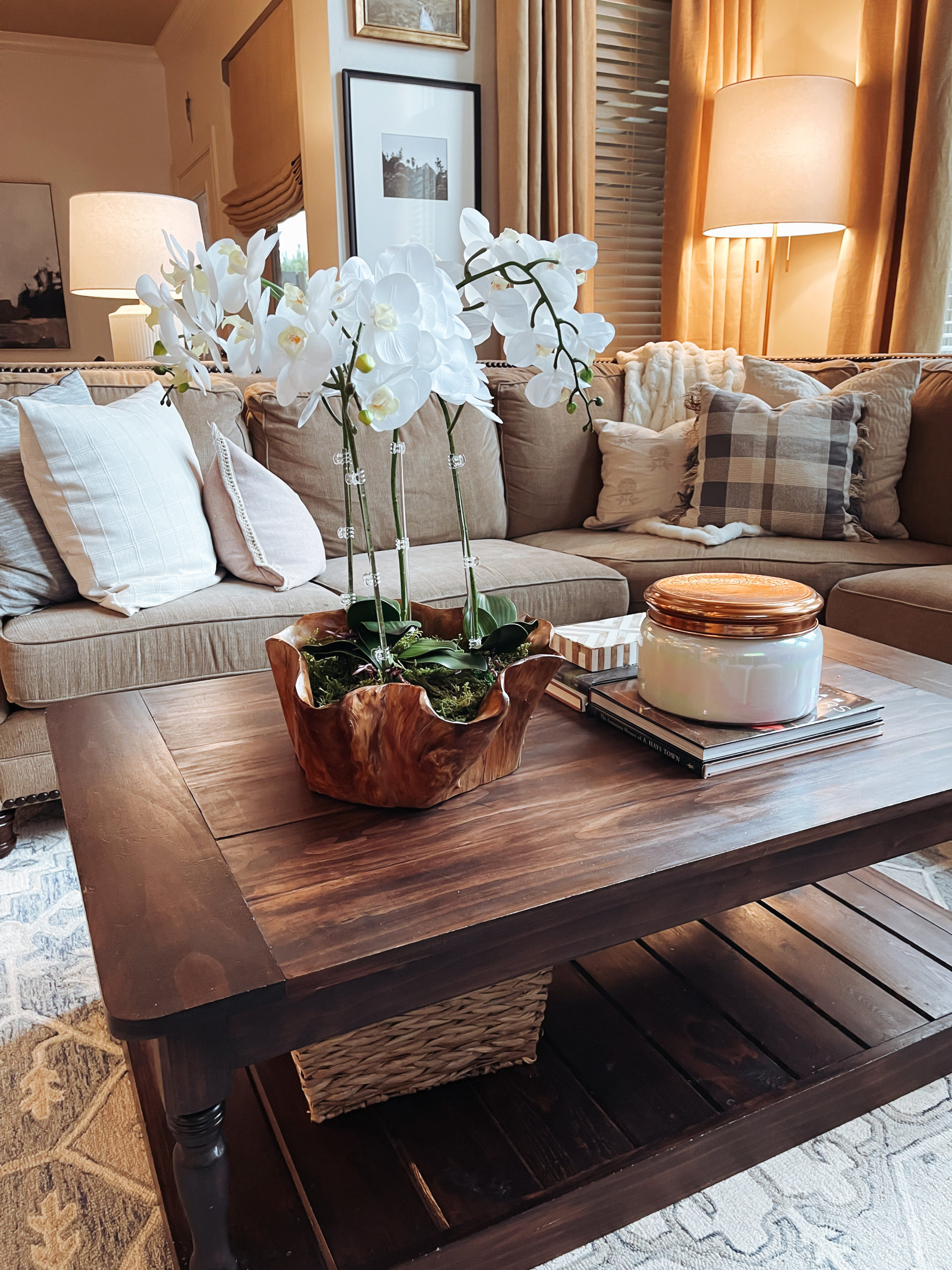
When I spotted this bowl in the kitchen aisle at Home Goods, I knew immediately that I wanted to make an orchid arrangement. A friend had a similar arrangement and I always admired it! Secondly, I wanted to try my hand at using realistic florals made out of latex. How real do they look, well Josh had to ask twice (and he helped me cut the orchid stems).
With the bowl in hand and an Amazon order (linked here) on the way, I headed to Hobby Lobby for the rest of the supplies! I picked up some styrofoam circles and a bag of moss and then we were ready to go!
First, you are going to want to cut down your styrofoam circle (if needed). Since the bowl is an organic shape, I cut and filled in the spaces and secured the styrofoam together with low temp hot glue. I was careful not to glue any styrofoam to the bowl as I wanted it to be sturdy, but removable in case I want to use the bowl for something else in the future.
Next, you are going to want to cut your orchids to size (we trimmed 3″-4″ off the bottoms). Stick in the styrofoam and secure with hot glue. I then took the acrylic dowels and hot glued them to the hot-glue base and secured to the stem with clear clips. Everything about this process is “fake it till ya make it.” Then, you are going to want to place the orchid leaves near the stems. I used 3, depite having 4 flowers, since the base looked over crowded with all of them in there. Now, you are going to want to cover the entire base with the decorative moss. Make sure to glue it down to the styrofoam to keep it anchored to the styrofoam.
I just love how the arrangement looks in this space! It really gives a luxe feel and it didn’t cost me hundreds to make!
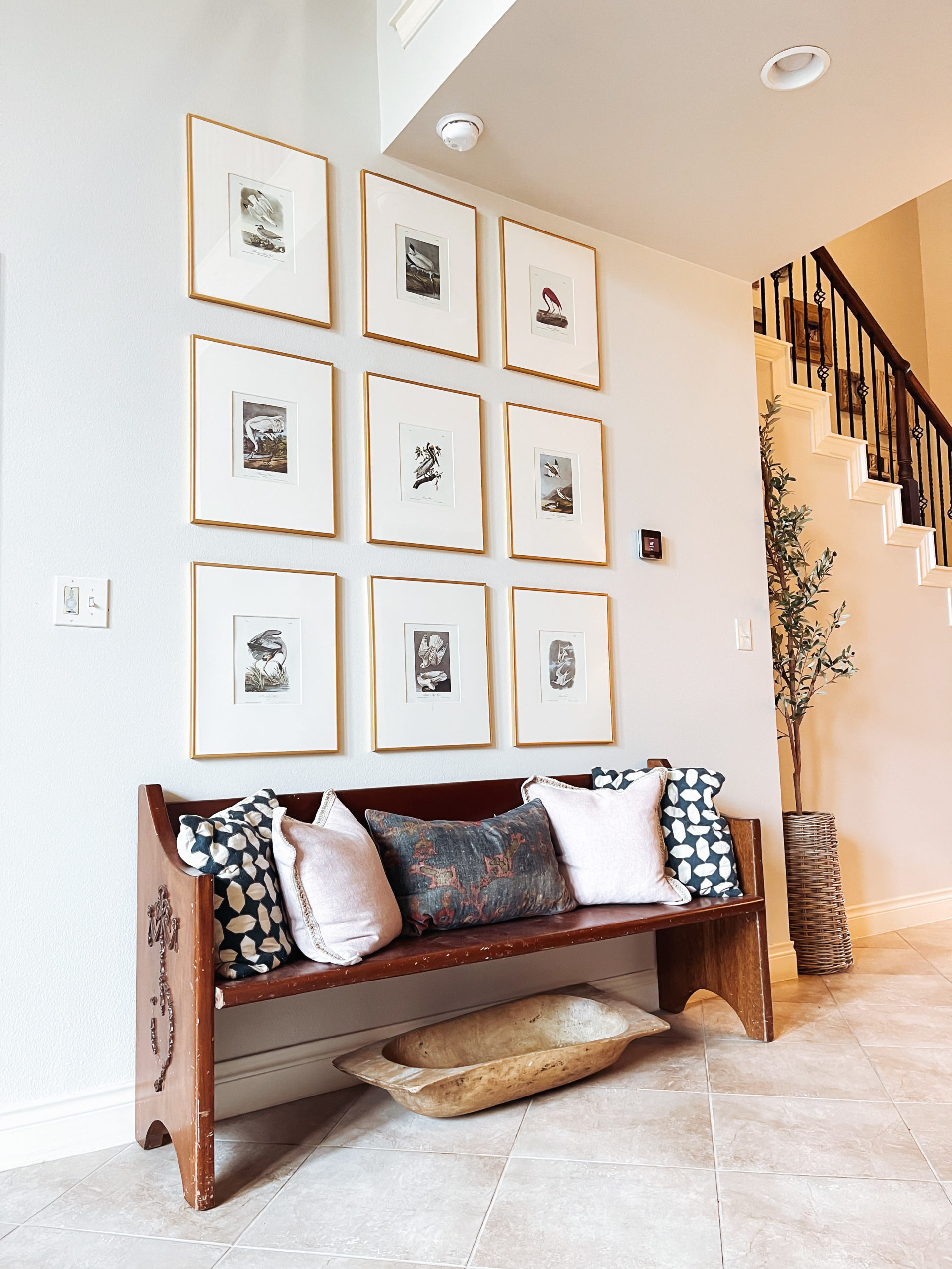
Many years ago, I purchased an old Audubon print from Etsy. When I took it in to have it framed, the associate made a comment on how expensive these prints were and how they were beautiful investments. Fast forward 10 years and they are digitally available and the most popular prints are available through Pottery Barn.
When we repainted our home in 2020, I knew that I wanted an on trend and symetrical gallery wall. One that would make a statement on this large wall without investing a ton of money. Another challenge was finding artwork for the frames, I wanted something beautiful and subtle in a variety of colors. Something that would be timeless and coordinate with my ever evolving throw pillow rotation.
I wanted artwork in this space since our family photo wall is right behind this one.
I chose these 16×20 frames that are $20 and invested in a massive book of Audubon prints. Best budget artwork/decorating hack! I found mine for under $20 and have it linked below. I selected my favorites from the book and created the gallery wall above. The hardest part of the process was making sure the pictures were hung straight and level.
I loved this wall so much, that I created another one in our guest room with animal prints from the same book. I still had hundreds of prints left over, so I gave the book to a friend for her to create her gallery wall!
I love how the framed book prints elevate my home. I am always getting compliments on both spaces and it is literally as simple as taking an old book of prints, placing them in a simple matted frame, and giving your wall decor an elevated makeover that you curated yourself!
Let me tell you about my new best friend! Hampr is a laundry service that will pick up your laundry from your doorstep, wash according to your requested settings and then deliver it to your doorstep the next day. It arrives folded and ready to be put away!
Laundry is my most despised chore. Using Hampr makes it so easy to delegate out the majority of our laundry so that it is one less task on my list.
Signing up is so easy! Just click on the link and download the app. From there, you type in your address to see if it is available in your area! If it is, you sign up for a yearly membership which is typically $39 but if you use code PERKINS50 for 50% off your membership fee! That fee includes your first 4 Hamprs, and they are collapsable, compact and easy to store (and pack)!
Scheduling and setting your wash preference is super easy and you pay a $10-15 washing fee for your washr to pick up your hampr and work their magic! Plus, I’m obsessed with how my washr folds my clothes (it’s the little things).
It’s seriously like an Uber for Laundry! It’s women owned and available in several states, and growing as you read this! I love gifting subscriptions to new moms and friends who I know could use a little break. You can use the service as much or as little as you need.
Some weeks I use it 1-2x, and other weeks I do it myself and am remind why Hampr is a huge blessing in our family. I even road trip with our Hampr! I love that I have the option to schedule a washr while we are at our destination (if available in area) and have fresh laundry mid-trip so that I can spend time with my family. If it’s not available, then our laundry is already sorted and ready for pick up as soon as we pull up in the driveway!
Need some help lightening your laundry load? Click this link to download the app and use code PERKINS50 and get your first year + 4 Hamprs for under $20!
P.S. If you happen to love doing laundry and looking to make some extra money, you can apply to be a washr in your area! All of the details are on the website for you to get started!
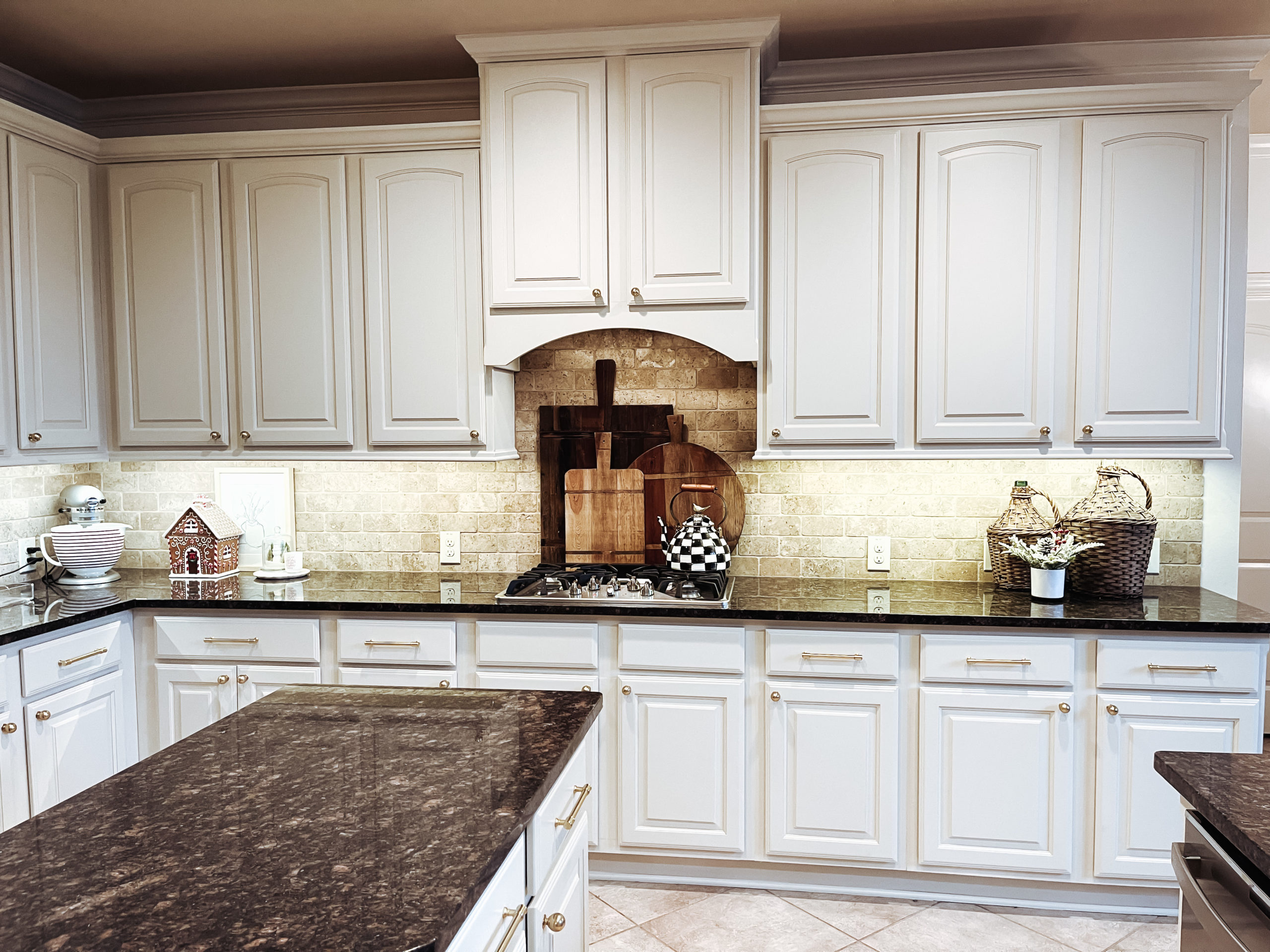
It all started when a reels challenge ended up with a viral reel. Never in a million years did I expect almost 4 million people to view a silly video that I coerced Josh to film with me. So many people chimed in on whether or not we should paint our cabinets. I took a chance and priced out this project as soon as Josh agreed that the internet had spoken and it was time to lighten up the kitchen!
Now, when we first moved into this home, I loved the cabinets but hated that they were paired with the dark granite. We both agreed that we would replace the granite when we built our outdoor kitchen. However, we started to realize that the finish on our cabinets was looking worn and it was time to tackle this project.
I knew I wanted light cabinets, however, I didnt want bright white. Due to the neutral backsplash and warm whites already on our walls (details here), finding a complimentary color for the cabinets was a little bit of a challenge (but not impossible). My first choice was Benjamin Moore Creamy White or Natural White. Those blended in with our BM Navajo White walls and SW Navajo White moulding. I made several trips into our local Benjamin Moore PDS Paint Center to grab paint samples. We ended up going with the color Clay Beige and I am in love with how it turned out!
The Process:
We took off all of the cabinet and drawer fronts and wiped down every surface with a TSP Substitute and Scotch Brite Pads. You want to remove any dirt/grease along with creating a rough surface. We ended up doing this step twice to make sure that we didn’t have any issues down the road. Sand down any imperfections and drips in between coats.
Next we taped off the cabinets, floors and created a paint booth around our room. This was probably the MOST TEDIOUS part of the entire project. It took us a solid week of evenings to tackle this part and make sure that the insides of the cabinets, floors, granite and ceilings were covered to prevent any over spray.
It’s time to spray primer! We opted to invest in this airless spray system since we have several other big projects that will require one. If this is your only project, renting one may be the most cost effective. You are going to need a paint suit + respirator for painting. Trust me, we had to toss our paint clothes and had over spray in our hair for a week before we made a trip to Lowe’s for paint suits! Lesson learned! As for the primer, we opted for a fast drying alkyd resin primer (Insl-x Prime Lock Plus) for its durability and smooth finish. With the spray gun, we only had to apply one even coat of primer.
Paint! After allowing the primer to dry/cure for 24 hours, it was time to spray our cabinets! We opted for a water-based paint for the fast drying/curing time. Once our interior was sprayed and we were able to access our kitchen again, we opened our kitchen back up for business and created a paint booth in our garage to tackle our cabinet and drawer fronts. This part took the longest! We had to work around our work schedules, weather and humidity.
Install hardware! I wanted this investment to have a timeless and traditional feel. I opted for an aged brass finish and went with a classic ball cabinet knob and a 6″ pull for the drawers and love the traditional feel that this hardware gives to the space.
Was doing this project worth it? Absolutely! Despite the extra time it took us to complete by tackling the project in our free time, we saved a ton of money! Even after splurging on higher end pulls/hardware, we still came in thousands under budget vs. the estimate we received for a professional to do it for us. Josh and I both love how it turned out and how much happier we feel when we walk into the room!
“Hallelujah! Holy S*!*, Where’s the Tylenol” So glad this project is finished!
Refreshing our home has been a mission of mine since we locked down in March 2020. Over the last 18 months, Josh and I have refreshed our home and are digging it out of it’s early 00’s rut! At this point of our refresh, neither one of us is shocked to walk into a full blown project. (Selecting Paint Colors, Powder Bath, Dining room decor, and Guest Bath projects linked here!)
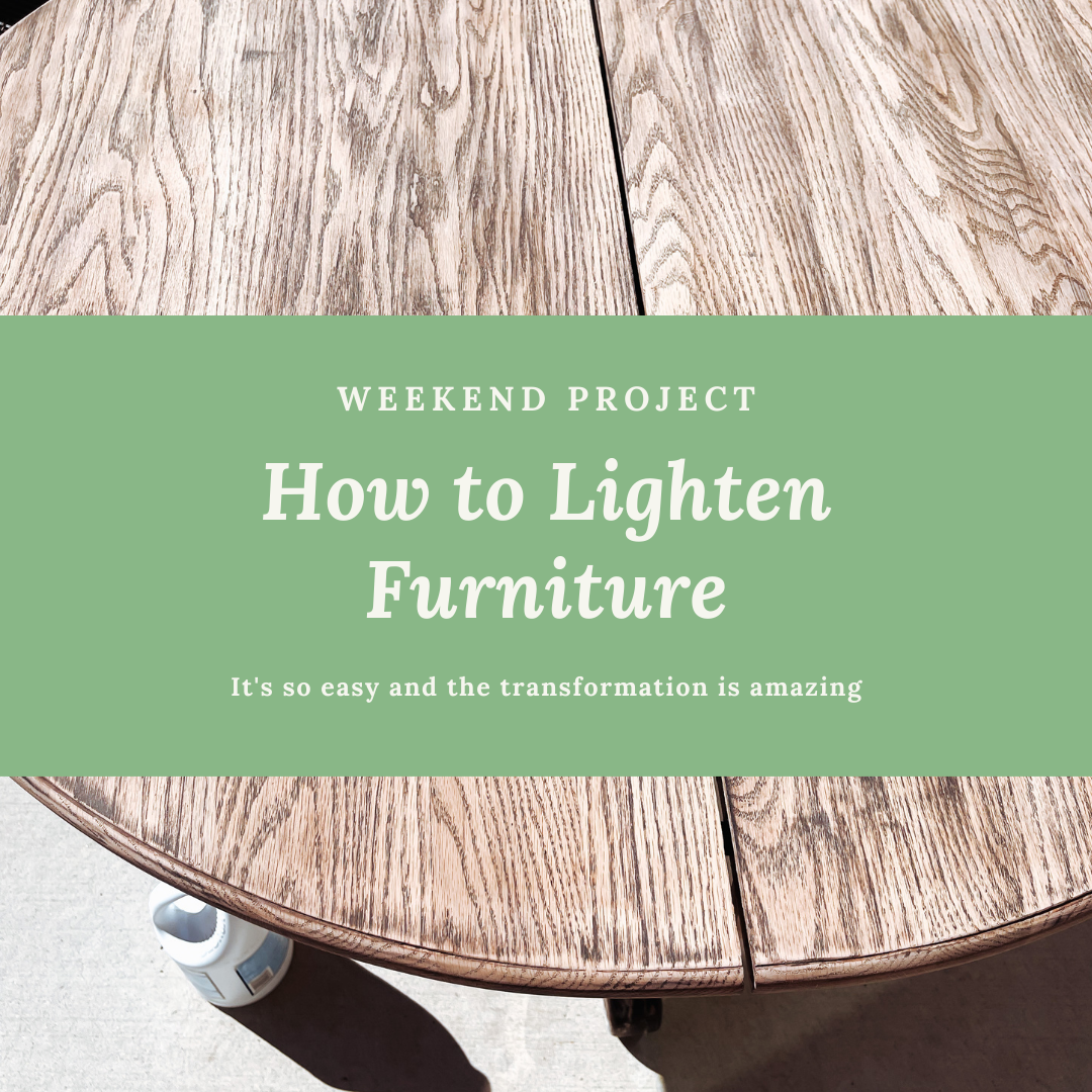
Josh will tell you that I am the queen of online garage sale pages and resale stores. I love the thrill of taking something old and solid, and turning it into a custom piece for our space! When I picked this table for $80, I saw potential. I was also 8.5 months pregnant and preparing to move into our current home. As soon as we were mostily unpacked, Josh re-stained the table for me using my favorite stain (Java by General Finishes). While I loved it, we also picked up these black chairs (fo-free!) from a neighbor, and we needed to pivot and find a way to update the table so that the chairs stood out!
Our Before
I knew paint was not an option, I’m so over the chalk painted trend. While this paint has a purpose in other places in my home, it just wasn’t an option as I am going for a more transitional style in our main living space. After a trusty Pinterest and Google search, I knew I wanted to strip the table and bleach it for a more modern feel!
So I did what I do best, I started my project when Josh was at work! I started off by stripping off the old top coat and as much stain as I could. I knew it would be a feat considering that I was going from dark to light! After removing as much of it as I could, I broke out our mouse sander and got to sanding (we used 400 & 220 grit)! A mouse sander will help you to get in all of the nooks and crannies to sand down to the natural wood.
Now here is the fun part! Make sure you are wearing old clothes because you will be working with bleach! Take a natural bristle brush and a cup of bleach and paint it onto the wood in a consistent motion and avoid drips. You can do this process in a well ventilated area, but if its sunny out, you are going to want to work in the sun because it helps to lighten it faster! I applied 6 coats of bleach to get this effect. The bleach will pull the old stain to the surface and out of the wood. As you can see, we still had a lot of dark stain in the grain of the wood, but I decided to embrace those imperfections as they would compliment our chairs.
During the bleach process
**There are 2 part furniture bleaching kits out there (linked below), and I believe that they may be a tad more effective, but with the delays of 2021, they were over priced or sold out at the time of this project. (I already have another piece in mind for a DIY when I can locate one of these kits at a good price)!
Lastly, we decided to seal our table with a non yellowing polyurythane. I wanted this table to maintain it’s bleached coloring and not turn yellow after my hard work. We decided to go with Minwax Polycrylic and applied with a foam brush.
We love how this space turned out. It cost us a whopping $20 as we already had most of the materials and tools on hand! And with the money that we saved, we added a rug and a new fixture and STILL saved a ton of money! I’ve linked everything (except the clorox) below! Let me know what you think!
-Mitzi (and Josh)
Finished Product
Still have some previous stain detail, but we were going from super dark to light. We knew this was a possibility but stil love the lighter wood and character of the grain.
To be honest, I’ve never reallly LOVED my dining room. I love little bits and pieces of it, but there were certain spaces that I never found decor that looked right in my space. I thrifted my sideboard and although it has a ton of space to store my fine china, the top of it has always proved to be difficult to decorate given its odd size.
My decor taste has changed in the last 5 years, and although I love my dining room furniture, I really wanted to give it a more transitional update. I wanted to do so as budget friendly as possible, and well frankly, the Target/Studio McGee collection never dissapoints.
I started with the mirror to build the vignette and did a little happy dance when this artwork nexted perfectly in front of it. I flanked the other side with the beautiful brown glass vase and elevated it slightly with an old book, then filled it with dried wheat branches for dimension.
Once I had my anchor pieces, it was time to accessorize. I loved the wooden chain and pumpkin. I actually had other ideas for these pieces, but they just nested perfectly here. Next, I fell in LOVE with this candle and match vessels from the Old Flame Candle Co. This was a splurge, but I love that I can send it back to be refilled and it becomes the candle that keeps on living.
Of course, it wouldn’t be a dining room refresh without a little seasonal decor! When I was shopping at Target, I came across these pretty, rustic ceramic pumpkins. Josh lost my Halloween tote in the abyss that is our Christmas corner, so a festive fall tablescape it was! I paired it with some vases, both new and old, and some antique candle holders. I tossed in bunches of silk mums from the craft store and… voila! Even my wine fridge is warm and cozy with my peace plant in a warm toned basket. Can I just say how much I love that warm tones are back!
When we moved into our home, we loved the gray that the previous owners painted our entire home. It was warm and homey, and very Restoration like. However, it wasn’t long before we realized our ENTIRE home would need a fresh coat of paint. The paint finish that they used was reformulated and we could not touch up a single spot without being noticable. No bueno with a house full of boys. We put off this task for 4 long years before 2020 forced us in our home and boredom had us purchasing a ridiculous amount of paint.
Last year was the year of 20′ ceilings and a powder bath refresh. This year we are tackling the bathrooms (and hopefully the boys bedrooms). I decided to give our guest bath a little makeover. It was a small enough space to step outside of the box and test out painting our cabinets.
I set my budget at $250 and I was determined to come in under, and I did just that at $249.50! We started off by taking out the old, frosted light fixture and painting the walls with Benjamin Moore Swiss Coffee. This is my go-to color in rooms where we do not have a lot of moulding. Our moulding is Sherwin Williams Navajo White and can pull yellow in some lighting and we do not want to repaint it. It’s also a great shade to match our tan ceilings and our very brown tile.
Once the walls were painted, we installed the new light fixture! I’m usually not a huge fan of modern fixtures, but this one is absolutely stunning and I fell in love with it so much, we are installing them in the boys Jack and Jill! Honestly, this was the biggest part of our budget and it was worth it!
Last, and the most tedious were the cabinets. I painstakingly sanded, prepped and painted the cabinets. In hindsight, I wish that I would have documented the process, but it was A LOT, and I was ready to get it finished! We went with Benjamin Moore Deep Olive and I love it! It’s a great mid-tone green that pops in this small bath. This was the project that had us debating whether or not to paint all of our cabinetry in our home and I am sold. But not before we invest in a good paint gun to make the task easier!
I kept my white monogrammed shower curtain (not pictured) and accessorized with this watercolor picture and topiary that I picked up from my local antique store’s clearance booth. The rug and candle are HomeGoods finds. Soap dispensers and basket were Target dollar bin finds, but I’m linking similar here! (towel, soap dispenser, basket, and candle)
How do I love thee? Let me count those ways! First off, let me preface by saying that I receive a small commission when you click on my link and use my code but the opinions are all my own!
I was talking to my mentor who has become one of my dearest friends and she was talking about how she saw somewhere that Pura was one of top 3 things that influencers promoted that wasn’t worth the hype. I was like “shut up, no its not! I seriously love them!” Seriously, I’ve had mine over a year and I’m in love! BUT, it was a learning curve to get the perfect recipe down pat and I’m giving you all of my tips below!
First off, if you want your entire home covered in scent, you need to figure out placement. My home is 3,600 ish square feet and I have 4 units. Two downstairs on opposite sides of my home and two upstairs. One on the boys side and one in our open toy room area. The suggestion is 1 per 1000 sq feet but honestly if you wanted to put one in every room, you could. You would just set your fragrances at a lower strength!
Secondly, when selecting your scents, you want to pick two different scent profiles! This was one mistake that I made when first starting out. I love fresh and clean scents, so I will plan for my monthly subscription to include a fresh floral such as Bridgewater Sweet Grace and Nest Grapefruit. Or, Nest Bamboo with Capri Blue Volcano. You can always swap fragrances before your subscription processes, so the selections are endless. Plus if you don’t like a fragrance, you can return it for another!
Next up, we are going to talk about the app and why you don’t want two of the same scents in the device! The app is pretty user friendly! The app will take you through the set up step by step. My 11 & 12 yo know how to take my phone and switch out fragrances. I won’t go into detail about all of that… What I will go into detail on is the calendar/timer feature and scent intensity. I feel like this is the deal breaker on loving or hating this device!
Let’s talk about the calendar & timer! That olfactory system of yours tends to get used to scent. Ever have someone come into your home and compliment how good your home smells, but you don’t know what they are talking about? Yeah, when you smell something for a long time, you are so used to it that you don’t register the smell anymore! This is why you must tap on your fragrance and take advantage of that little calendar tab at the bottom right! I set my first fragrance to run from 7am to 4pm and my second to run from 6pm to 12am. Remember how I mentioned about my selecting a floral and a citrus? Well, we can smell the difference when the system switches over and we notice the fresh florals when its their turn! Before when we would just let a scent run, we had a hard time smelling it after a few hours. However our friends could smell what we could not!
Lastly, we are going to discuss scent intensity! I really believe that this and the calendar/timer holds the secret to your scent lasting all month long. If you just plug in your scent with no adjustment, it will not last you (and your nose will get used to the scent even faster). Like maybe a week if you are lucky! When I first plug in a scent, I set the intensity between a 3-4. The oils are at their strongest and a little goes a long way. As the scent wears on, I will open the app and toggle over the intensity strength as the month goes on and I notice that it is not as strong as it once was.
I sure do hope these tips are helpful! We love our Pura system and have for over a year! I love that my home smells like my favorite candles and scents without burning a candle. My home always smells fresh despite it being filled with 4 smelly boys (5 if you count my husband) and 2 dogs.
And as always, click here and use code MITZI15 for 15% off your purchase!
Out of all of the rooms that I have painted in my lifetime, never did I realize how complex this process can be! When we moved into our home 4 years ago, we knew that it needed some TLC. Even though the previous owners had an interior designer help them with the décor of the home, there were just some tastes that were not for us. I mean, HELLO aqua venetian plaster in the master bath!!! It took two years of being nauseated every time I walked into my bathroom before I took a gallon of Kilz and a paintbrush to those walls! It was so taste specific and gross that I had no problems covering up a job that I know cost thousands to apply! This is where our dilemma started. The pretty white that I chose to paint these walls did not coordinate with our floors and trim (insert face palm)! I mean, I don’t even have a before photo of this room because it was THAT. BAD!
When we first started painting our bathroom, I chose a popular white color that didn’t coordinate with our almost 10 year old off white trim and brown-ish tiles and features. Since, I have been staring at those walls trying to figure out where I needed to go next. Thankfully, I have located a pretty creamy white (or possible a blush white) that will coordinate and I will be tackling this project, next!
Okay, so lets talk the technicality of paints… did you know that all paint colors have undertones? I myself happen to be sensitive to purple undertones. I would look at the dark greige on my walls and see the purple shades… If you know me, you know that purple is one of my least favorite colors (I blame my mama for this one). So, it just bothered me. But this is not totally why we repainted these walls. See, in 2012-2013 -ish, Benjamin Moore reformulated their pearl finish paint and guess what is on my walls?! You betcha! We had walls that we couldn’t touch up, with 4 boys, that was not an option. I had so many little white dings that stood out like a sore thumb and It drove me batty!
Lets talk LRV! So aside from undertones you have a paint’s LIGHT REFLECTING VALUE. On a scale from 1-100, the LRV tells you how much light will be reflected in your room. 1 being super dark and 100 being bright. I knew that I wanted our main living area to have a LRV of at least 65 because our space is lacking in recessed lights and adequate light fixtures, but that is a “whole nother” post, y’all! Plus, our previous paint color was in the mid 50 range so I knew based on that, we needed a color with a higher LRV!
For instance, my breakfast nook and dining area went from an LRV in the mid 50s to an LRV of 78! They now look fresh and crisp and tie in perfectly with my kitchen. We went with Benjamin Moore Navajo White, mostly because that’s the color of our kitchen, but this is where I actually started researching all of this. Our trim in our home is Sherwin Williams Navajo White which is a creamy, yellowish color with yellow and brown undertones. Remember our Master Bath, the trim totally clashed with the BM White Dove that I attempted to paint it. I’ve figured out that yellow and purple undertones look best on the walls within our home.
That being said, I used Kylie M Interiors website to cross reference every greige color that Pinterest suggested. This cut down the amount of sample cans that we purchased. We narrowed it down from 5 to our top 2 in TEN MINUTES! We were torn between BM Classic Gray with a LRV of 75 with passive purple undertones. Passive means that the undertone is livable and very unnoticeable, if anything it should reflect the tiniest bit of pink. Our second is BM Edgecomb Gray with an LRV of 63 and its a greige that pulls a little more on the beige side. While Edgecomb Gray is what we would normally lean towards, we have gorgeous custom burlap curtains that I want to pop in our living space, so we were so torn!
Ultimately, we chose BM Edgecomb Gray and we have lived with it for the last four months and I love it just as much now as when it first started going up on our main walls! It is the perfect traditional creamy shade and compliments our brown tones throughout our home while still giving it a much needed update and brighter look. We did break up the monotony by painting our breakfast area, kitchen and dining room BM Navajo White and we could not be any happier! Now off to the next projects! Re-painting our master bath and a powder bath remodel!
I hope this blog helps you on your journey to finding the perfect paint color! I have since used these tips to pick out colors for our other rooms and I cannot wait for those big reveals!